
THE RETRO KIT: NIKE’S ORIGINAL KIT DESIGNER, OG DRAKE RAMBERG
Drake Ramberg arrived in Germany in the early 1990s with the task of launching Nike’s soccer apparel almost from scratch. The studio was in the Nike Germany Offices located just outside of Frankfurt.
He was sent to Europe for a 2 year ex-pat assignment, and ended up building the Design team and designing multiple iconic Federation and Club kits before he left 6 years later.
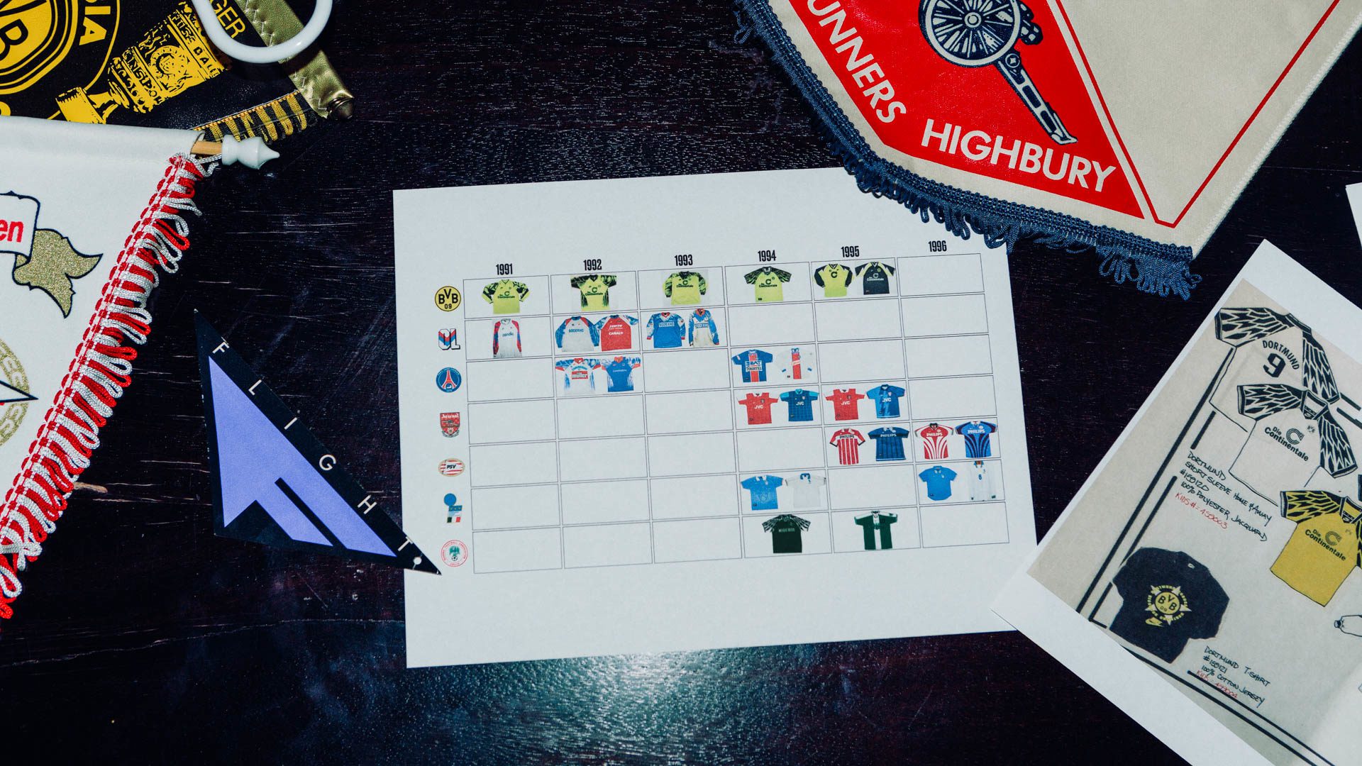
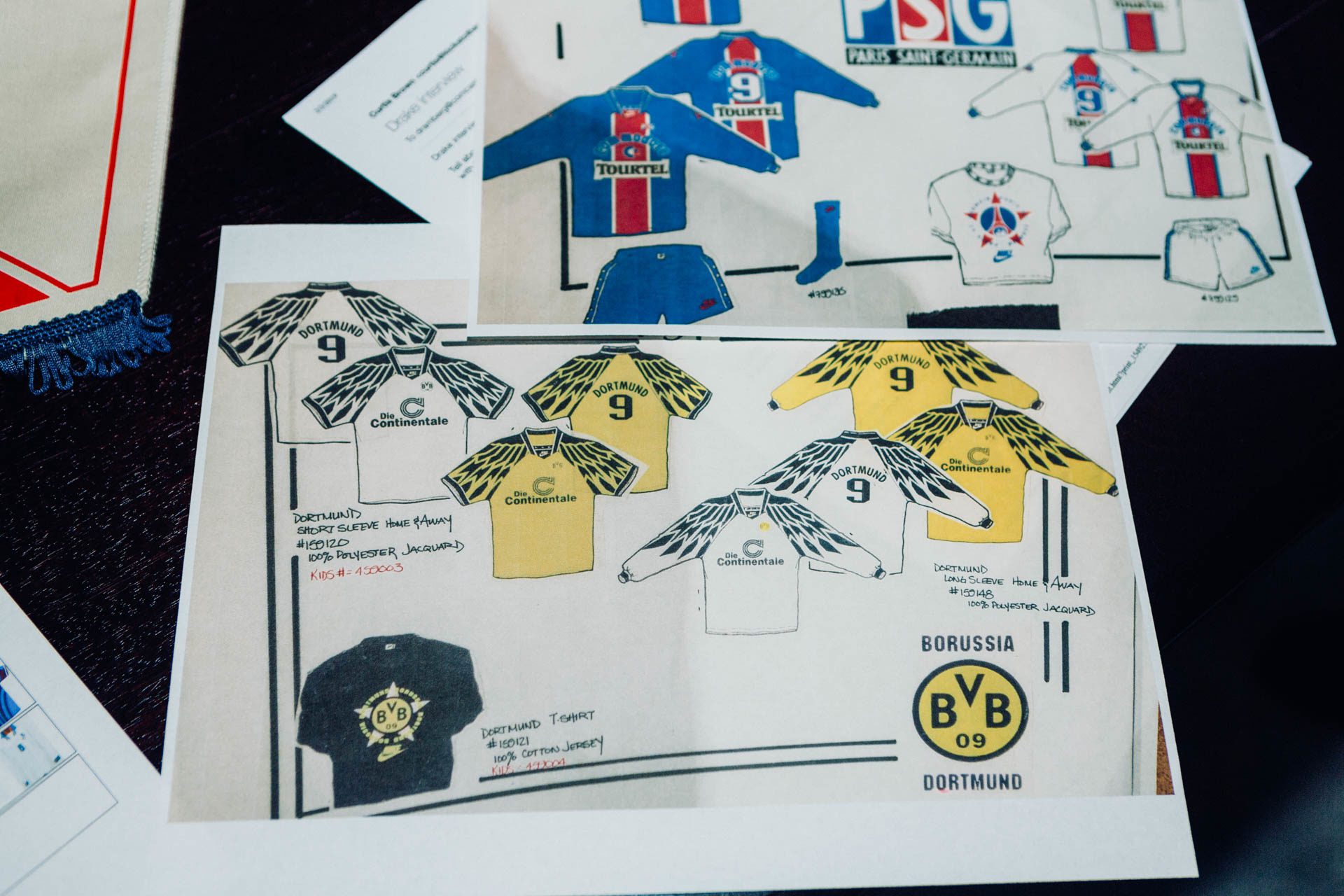
“Not only did we start up the Design studio, but we had to have all the right equipment to prep each design for production. “I worked with Canon to get printers, I had to set up a dark room, I worked with AGFA to get film projectors and film processors, we had to do our own separations, nothing digital back then… I also was assigned to work on the kits for Dortmund and Paris Saint-Germain’, and we also had Olympique Lyonnais at the time.”
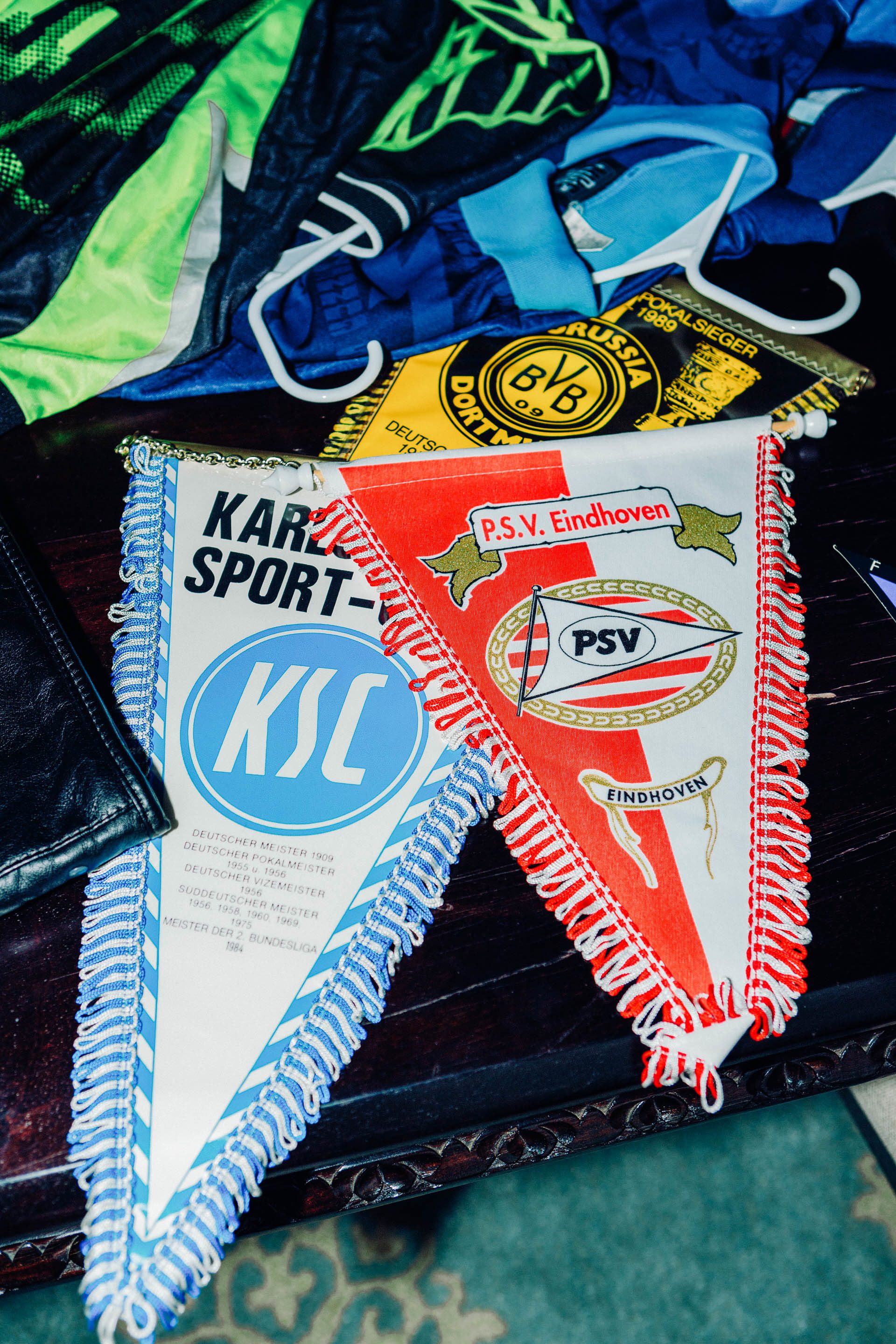
Ramberg grew up in Oregon playing youth soccer and graduated with a degree in Fine Art from Portland State University. He started working with Nike in 1986 as a freelance graphic designer before computers were the dominant tools of the trade. After creating the iconic Flight logo and the Nike Premiere logo…he was assigned to spearhead Nike’s football apparel graphics team and to create the kits and apparel for some of Europe’s most iconic teams including Borussia Dortmund, Paris Saint-Germain, Olympique Lyon, PSV, Arsenal, and the Italian National Team. This was undoubtedly a daunting task for Nike and Drake who in the early 1990s were just getting started in the world of international football.
“Growing up in Portland in the 80s, our only exposure to European Soccer was, Soccer, Made In Germany, which was on public broadcasting on like…Saturday morning and I had no idea what the difference between Bayern Munich or Dortmund was. As a designer you are almost like an anthropologist. You gotta go deep. Deep into learning what these clubs are. And this [was] pre-internet, okay. So basically you [have] books, magazines. By moving over there I was able to be on the streets, and travel and go to these clubs and see their trophies, see their locker rooms, go out on the pitch and talk to players and talk to managers. And that’s in order to just to do your job right and even then you are just scratching the surface on figuring out their history and figuring out what a club like PSG or Arsenal would wear.”
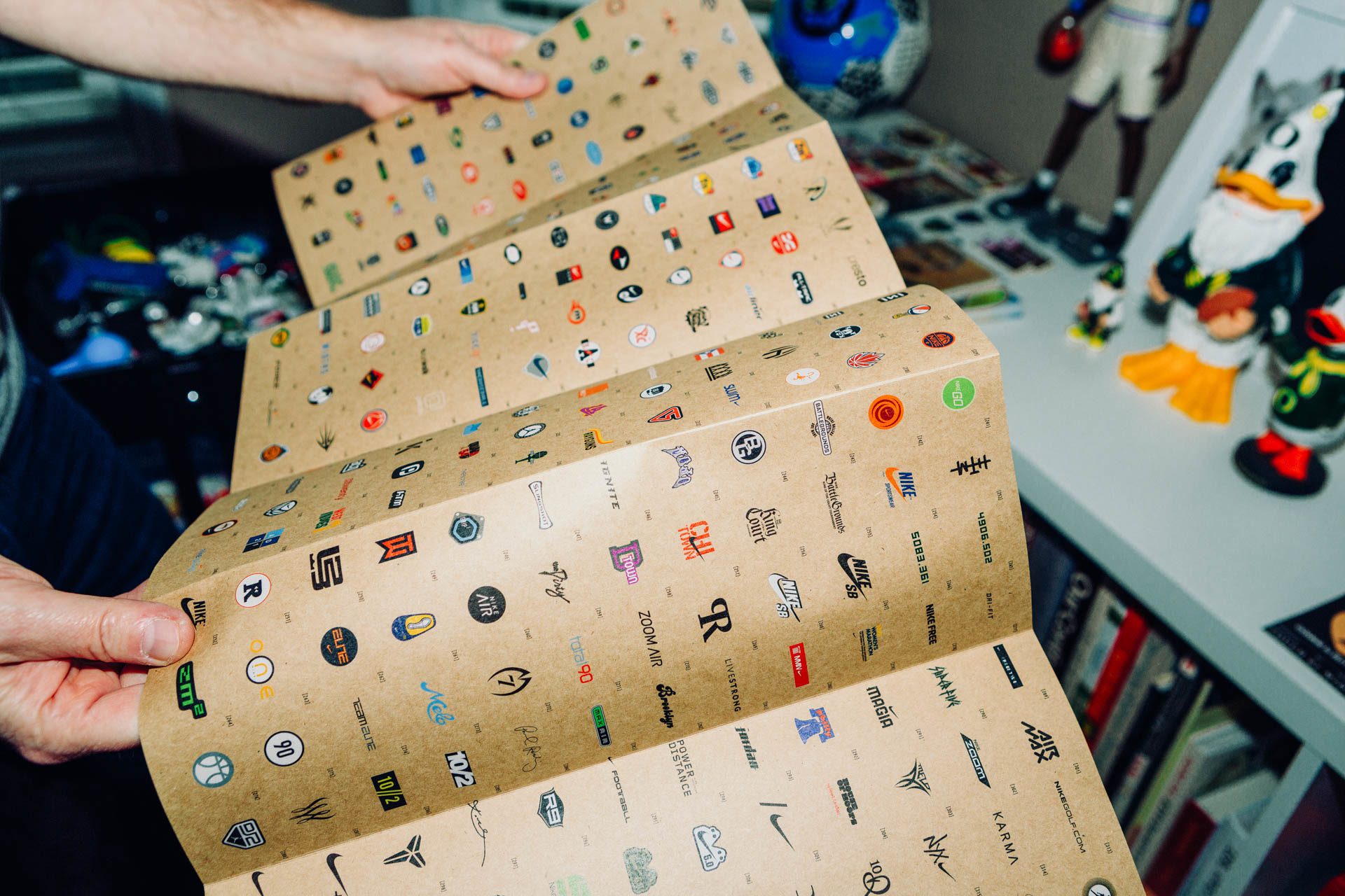
The fabrics and climate of kit design in the early 1990s helped foster creative freedom. “I was working on soccer in the early 90s and we were creating what Nike Soccer looked like…There [were] no rules and it was just me and my team being creative and working to extend and bring to life the legacy of these clubs…try to be true to the spirit. It was kind of a graphic designer’s dream back then because you could just have fun there [were] no restrictions. It was all about sublimated graphics, the jacquards, it was really built for the fans.”
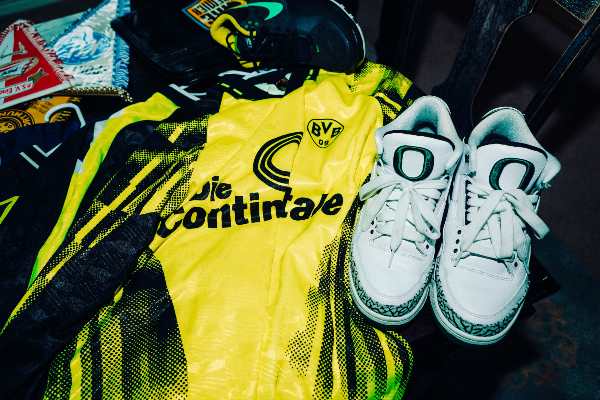
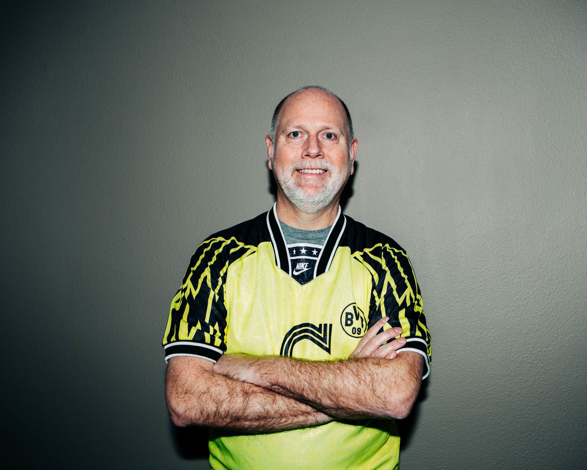
With that freedom, Drake Ramberg brought his own American sensibilities and background into his approach to designing some of the beautiful game’s most beloved shirts including the 1994-95 Borussia Dortmund kit and the 1995-96 Arsenal kit which happen to be the designer’s personal favorites.
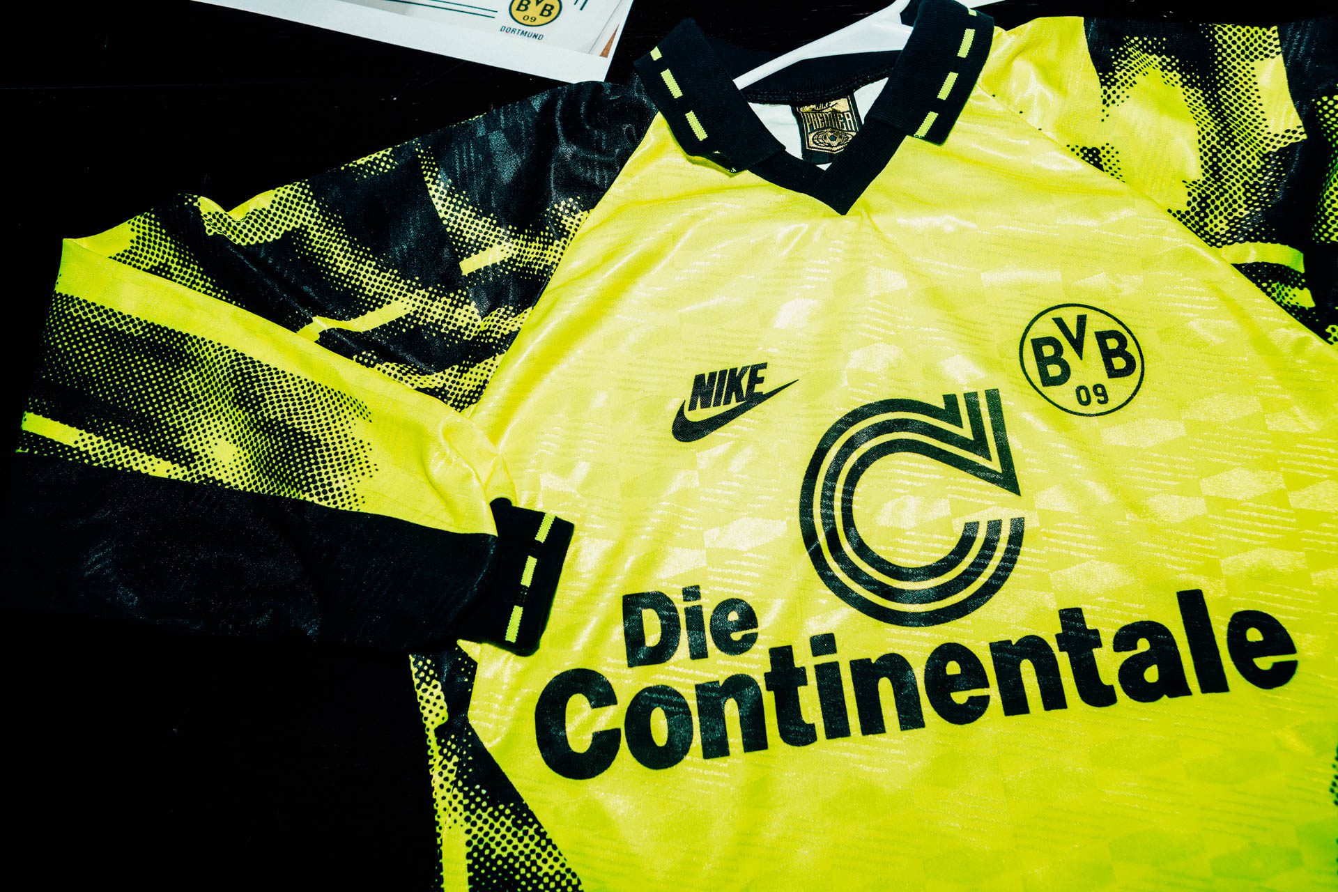
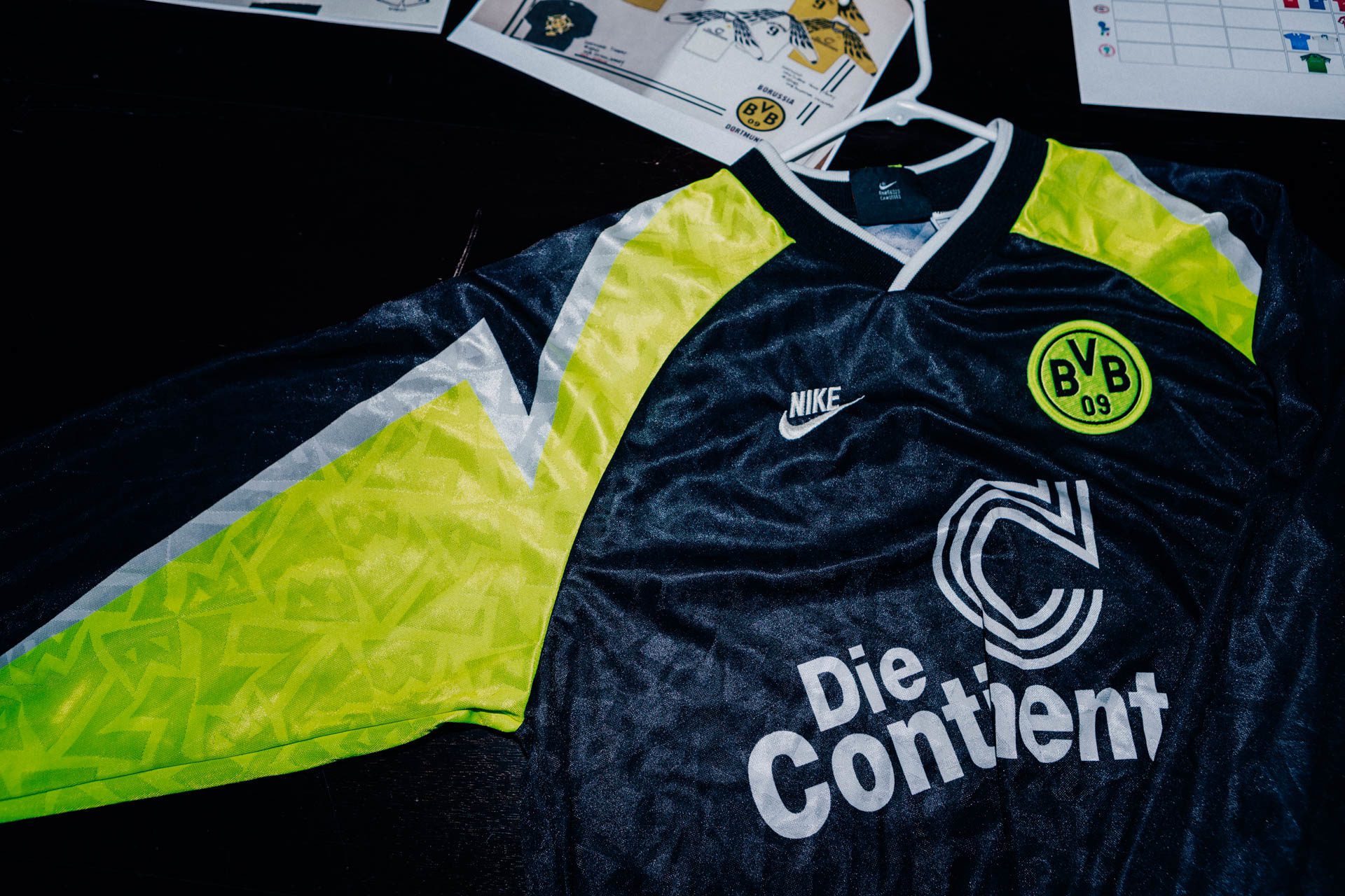
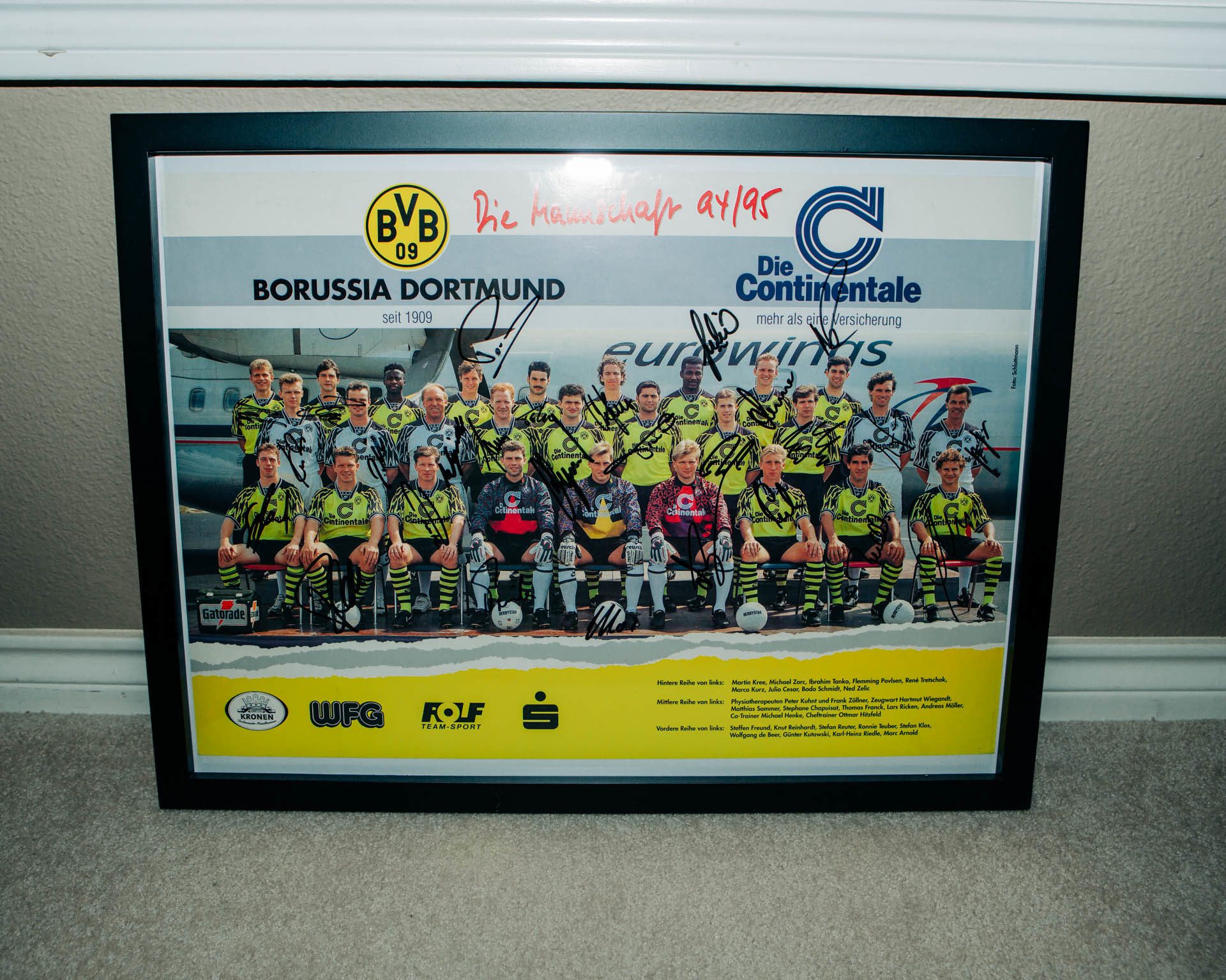
“I always go back to Dortmund. That was one of the first clubs that I worked on…I just felt like I had a kinship with that club. We brought in the Volt Yellow and it was such a Nike point of view and they let us take them where we wanted to. There [weren’t] too many restrictions. The first few designs were just having some fun with Nike graphics and motion and blur and those kind of things. But I felt like in 94 when I brought in the wings sleeve graphic—that was inspired by their Dortmund city flag, it had an eagle on it. All over Germany there are a lot of eagle motifs. I decided to go away from the blurred look into…clean geometric shapes. Every time I see it I’m like wow that’s cool.”
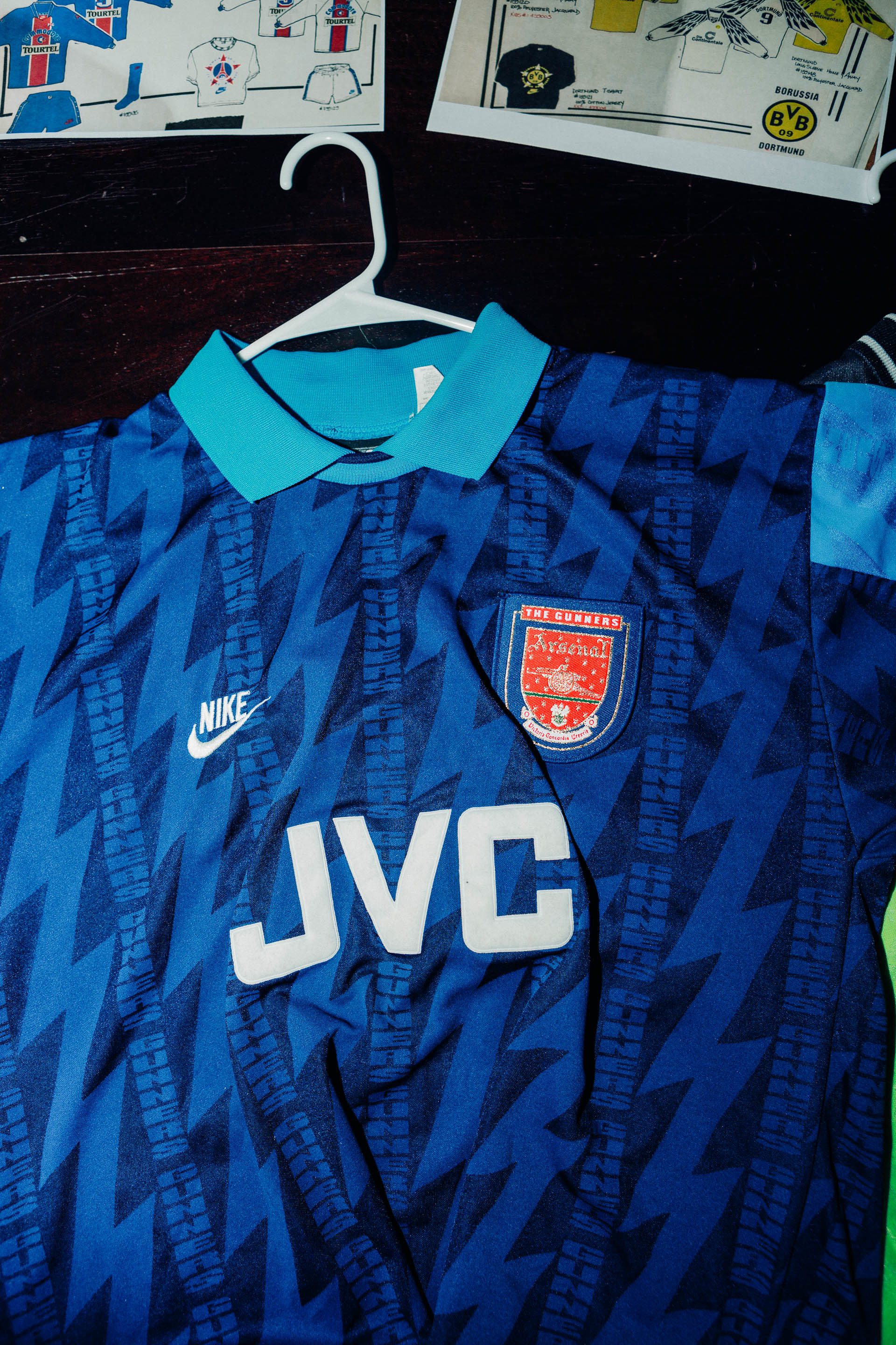
“The second one was Arsenal. Again I didn’t know an Arsenal from a Man City back when I got over there but I had traveled to Highbury and met with George Graham and some of the players and got a full immersion into English football. You’re learning about a club and figuring out, ‘what’s a Gunner?’ It has a military kind of background but how do you bring that to life through graphics? So I landed on just a lightning bolt as a motif to use to represent the Gunners and Arsenal. So the first kit in 94 was more of a tonal matte/shine jacquard. But my favorite one was the 95 one where it became more of a half [and] half shirt and more of a strong bold lightning bolt.
“What I thought was fun was bringing to a lot of the work that I did, as an American designer coming over to Europe, a lot of the American sensibilities or things I grew up with…In American sports every team has a nickname. So I had it say The Gunners’ across the top of their crest and then it had Arsenal on the back tail. So it was…bringing their nickname in which I hadn’t ever seen—their mascot or nickname on a jersey. So I was bringing in American graphic design and sport motifs by pulling out like the ‘A’ from Arsenal [which] was kind of like an Old English ‘A’ that [was similar] to the Atlanta Braves ‘A’ or ‘NY’ Yankees. It was a cool single letter. As you are designing a collection you need other elements to play with otherwise it’s just a badge on every style and they have a whole training collection, a whole fanwear collection so we wanted other elements to extend that so having a lightning bolt to play with, the ‘A’ logo, the actual crest, the word ‘Gunners,’ the word ‘Arsenal,’ helped us build out a whole collection. So it’s not just…the same thing on every style.”
“It was definitely a collaboration with my Apparel Designers, as they created the silhouettes, selected fabrics and trim details. We worked hand-in-hand to create each of these designs. I focused on the graphics and they developed the styles.”
The creativity and imaginative art that embodied the kits of the early 90s is something that still resonates with fans today. “It does seem like there’s a lot of this generation that loves that era just because of the fun graphics.”
The thick polyester fabrication of the early 1990s gear was a great vehicle for sublimation, jacquards, and plastisol graphics did result in bold and memorable designs but not the highest performance athletic apparel. “Like [the] PSG ones were just coated in with heavy, screen printed sponsor logos, so it wasn’t high performance.”
Originally Ramberg went to Europe on what he thought was a two year assignment but he ended up staying for six. He was there for the shift from graphic-heavy kits to the starker, higher performance kits that came to dominate later in the decade. “But then in 96…we wanted to bring performance fabrics into football…we were like, ‘let’s bring in Dri-Fit, performance fabrications, there was mesh on the sides and everything. From that point forward…you could see, if you look back, not just with Nike but…in the industry it seemed like for about ten years it was really just like clean and simple and there was a major shift from graphics and jacquards and all that stuff into more like straight-up solid jerseys and letting the performance fabrics do the work…because of the price of the performance fabrics and the nature of the knit [and because] they didn’t take graphics very well.”
With the introduction of new technologies like VaporKnit artistic expression does not need to be sacrificed for performance. Graphics and design elements are woven into the fabrication of the apparel. In the last couple of years Nike has released kits with bold graphic choices that were celebrated by the public. Specifically the Nigeria Kit for the 2018 World Cup. The shirt sold out instantly and created a buzz that was akin to a coveted sneaker release.
“It’s been satisfying to see the Nigeria kit and some of the World Cup kits. I was with the guys when they were designing them and I brought in my old jerseys and they were referencing them and it’s…fun to see…the spirit of Nike Soccer from the 90s [brought] into…2018.”
“There was a little bit of paying an homage to that 94 [Nigeria] jersey but bringing to the modern day. But I loved seeing it. It was great, not only the jersey but the whole collection around it was just really smart and really innovative…Having some fun with football and bringing it to what the fans are into.”
The fans are still into what Drake Ramberg did over two decades ago. “Another thing that’s crazy with social media…(follow OG Drake on the Gram @dramberg) is that back in the 90s I felt like I was working in a vacuum over in Europe…but now when I look at all the work that I did, not only in soccer but in basketball, and all these fans reach out now and ask, ‘did you do this?’ and they want to know all the details and stories behind the kits. It’s heartwarming, some of the conversations I’ve had. And it is exciting to have had a role in inspiring the Design team as they continue to create the future of football kits.”
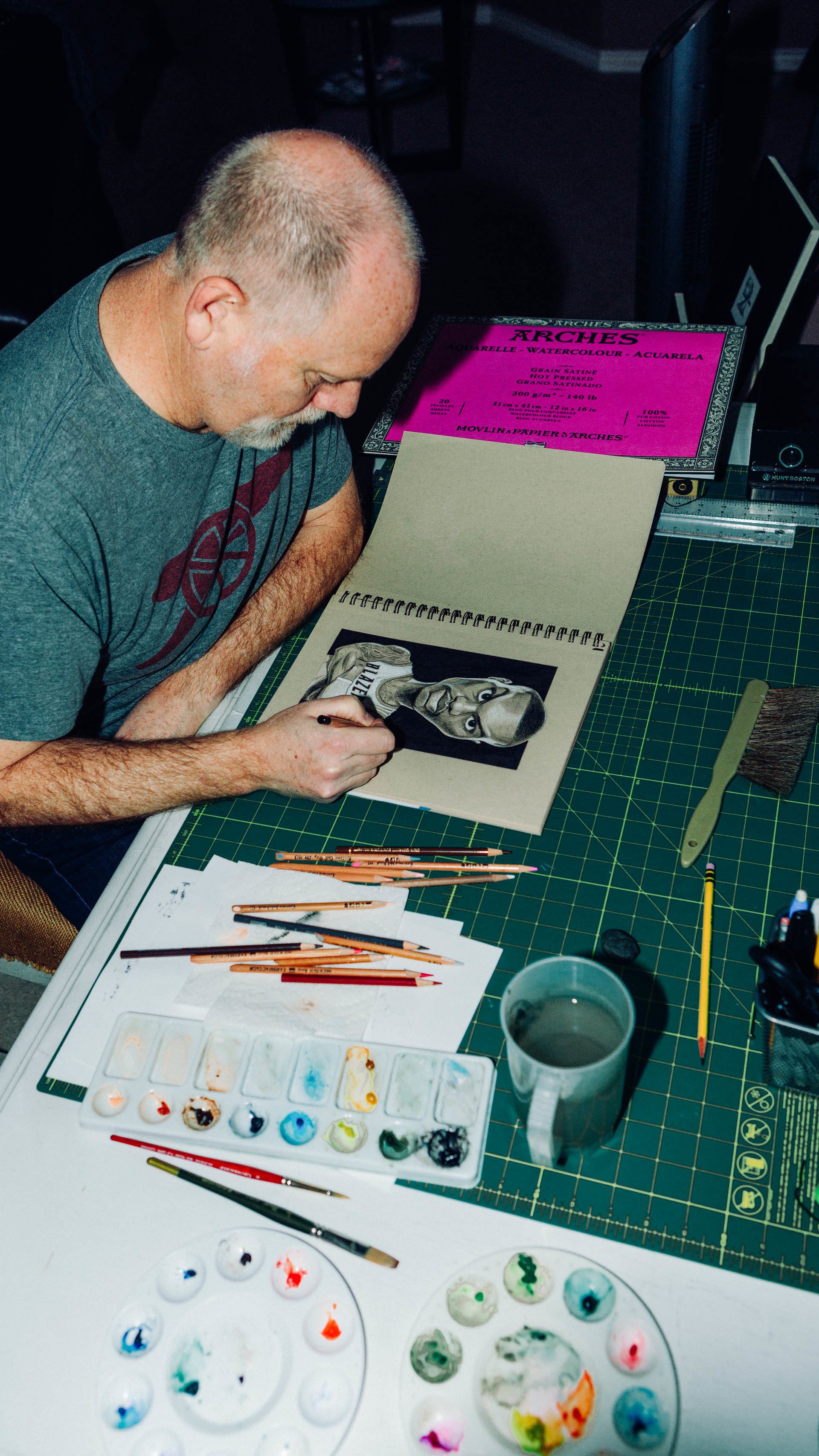
Drake Ramberg still works at Nike. Coming full circle, he helped as the Ops Director for Global Football when Nike moved the global football team he started in Europe back to Beaverton, Oregon a few years back. On any given day could be found mentoring young artists at the Blue Ribbon Studio on Nike’s campus.
