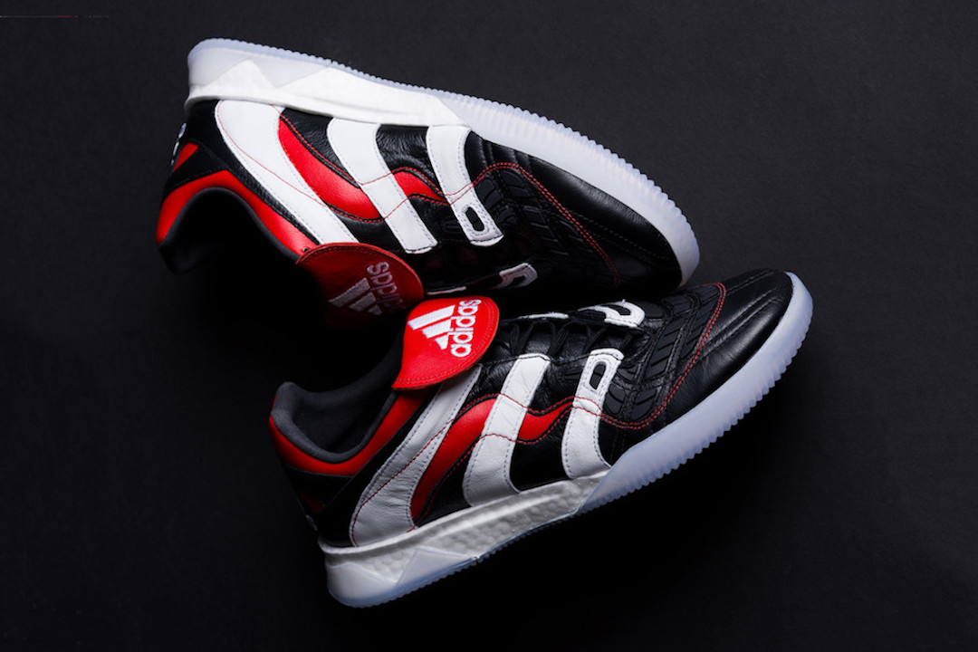
ADIDAS PREDATOR TR: AN EARLY BUT LASTING STRIKE?

The pun is intended when I say you cannot keep a Predator like this caged. If you follow all the familiar sites on leaked releases, you might have known about the return of the Predator in all its OG glory for quite a few weeks now, but I doubt you would have expected to be able to get your hands on a pair even before any sort of official press release. This is exactly what took place over the weekend as both Canadian retailers Livestock and Off the Hook struck early with this drop. It is no surprise that most sizes are now sold out, but of course, that is beside the point, as today I am here not to state so much of the obvious, but rather to explain how I see this Predator playing out in the larger scheme of things.

The electricity yellow Predator which released just last month provides as a good model of comparison for this latest release. I bought a pair for myself and as such, I can attest to the comfort, authenticity, and nostalgia that the shoe has going for it. However, even with all that, it is plain to see that this shoe just doesn’t have the same pull this latest Predator, which is back in the colors it is best known for, has. For this reason, I have to be honest with myself and all of you in admitting to experiencing the slightest amount of buyer’s remorse.

However, despite liking one pair more than the other, I can still be critical of the shoe as a whole. When looking at both the release pics or when finally putting on a pair of Predator TR’s myself, there is one thing that stuck out immediately. Design-wise these shoes are not winning any more hearts. To be clearer, these shoes are simply for the die-hards who connect with all the nostalgia that the cleat elicits.

With this sense of sanctity that I identify with the Predator, it is important to address whether adidas should be saturating the market with more of these Predator releases. Considering only a few weeks have elapsed since the last release, that is the indication I get and I obviously have my reservations about this. In churning out more Predator releases, it is possible adidas may just be giving the people what they want, but at the same time, they could also just be capitalizing on something that they believe has a short lifespan.

I regard myself truly lucky and blessed for having lived through what I lived. The predator is a hallmark of the soccer culture I have lived through, but I am not sure if quite the same example exists for the kids growing up and loving the game today. There is thus an unprecedented magnitude to this Predator release as I am now able to see past what it represents to me alone and instead look at what it can and should represent to every soccer fan old and young.

To every person reading this, I simply leave you with this: look past the consumerism and ask yourself how you will use this product to pass on a particular part of your soccer culture so that this culture simply doesn’t die, but instead endures through the soccer fans that come after you.

Images via Hypebeast.

THIS WEEK IN KITS

With the World Cup hangover in full effect, this week’s excitement from the world of kits may just be what the doctor ordered. With so much going on though, it might be too easy to lose track of all that was this week in kits. Luckily, KTTP is here to provide some clarity on exactly what kits we should prescribe ourselves as well as those we might survive without.

Without further ado, let the recap begin.


JUVENTUS

On top of their mega signing, Juventus held on to the headlines this week with their solid third kit option for the upcoming season. Though adidas is taking a page from Nike this year by essentially using the same template for all third kits, this template is stylish and modern enough for me to get over this fact. Add to it Juventus’ now all too common Scudetto and Coppa Italia badge, as well as Ronaldo’s number 7 and you, might easily have one the best selling jerseys to come out of this summer.


MANCHESTER UNITED

Next in the recap is Manchester United. Though not the best United kit I have ever laid eyes on, I like the fact that adidas designers are at least trying out something new in light of the fairly safe and conservative designs we’ve seen since the adidas takeover. This number pays homage to United’s railway heritage with a clever train track graphic that runs from the bottom to the top of the jersey. The overall design might not be new when it comes to the world of soccer as a whole, but that might just be where the appeal of this jersey is as it offers something new yet still familiar.


BAYERN MUNICH 

From not trying to reinvent the wheel, we move on to a team that is really going in a whole new direction. The new Bayern Munich away kit is what I like to call the mint chocolate chip look. I don’t use this description as a wholly derogatory term as I really do appreciate the color Bayern has brought on. I simply just think this kit is just far too simple and just needs a little something more to be truly icy, fresh, or whatever other word you want to use.


BLACKBURN ROVERS

Championship side Blackburn Rovers has also decided to switch up the color palette. In this case, the team does it for its home kit and the decision proves to be absolutely brilliant. The new touch of sky blue which now stands in place of the typical royal blue offering adds a greater touch of class that complements the club’s badge and retro Umbro diamond sleeves to perfection. This is one kit I call H2T good. Props to anyone who gets that reference.


HULL CITY

As we move on, the English Championship keeps my attention as Hull City is another club doing great things. In contrast to Blackburn, Hull sticks with a familiar away look with this black jersey with orange accents. Surely, it is a simple design, however, that collar and the way this color palette accentuates the club badge is enough for me to be wooed by this kit.


CHELSEA

Speaking of simple, it might not get any more simple than Chelsea’s new away jersey for this season. This, however, is not necessarily a bad thing because as much as I wanted to hate Chelsea’s jersey, I find myself really loving this design. Its definitely just another template look, however, the jersey’s yellow color with hints of blue are just too damn sharp and classic to overlook.


PUMAS

Even though this was a recap rather than a countdown of this week’s kits, I can’t help but end on the highest of notes. For that reason, I end this recap with Mexico’s Pumas who are the only team to lend not one, but two solid kit options. The range demonstrated in these kits is what really wins me over. On one hand, I have the home shirt which is everything I want and expect with that giant Puma logo, and on the other is the away shirt which relegates the Puma to your typical club badge with a classic pinstripe soccer look to go with it.

Though I am not making any decisions for now on which ones to buy, some of the kits I have covered this week have certainly made a compelling argument. Share your thoughts in the comments below on which kits you think will hold up to be some of this summer’s most memorable.

THE POSSIBILITIES OF KITH’S NEW ADIDAS SOCCER COLLECTION

A soccer jersey is a cultural symbol for many people around the world. Though we in the United States are not at that level or even close to it, I believe it is important to highlight how the past weeks have reminded us about fashion’s potential to bridge this cultural gap.

The latest example of this is provided by none other than Ronnie Fieg’s KITH x adidas soccer Chapter 3 collection. As a US Soccer fan, the collection is something I can appreciate for more than just its emotional significance. Indeed, the real value of this collection is in the voids it addresses for me specifically, and the very direct and simple way it goes about doing this.

I know I am not the only one who feels as though the latest US Soccer kits and apparel have lacked just a little something special. My pickups of recent releases have in fact been much more done out of mere loyalty to the team as opposed to general excitement of what I am looking at or a desire to show that around. It is simply what’s there, however, no one can disagree when I say that we deserve a lot more.

The KITH collection is something US Soccer should take a closer look at. Despite Ronnie Fieg not being a soccer expert or passionate fan at that, it is clear he may very well have a better understanding of exactly what is required to take soccer to the next level here in this country. Simply put, Fieg knows that to keep people engaged with the sport and to bring newcomers into the fold, the apparel just has to look good.

The collection has obviously got my attention, but rather than talking about the collection as a whole, I have decided to focus on the few pieces that offer the most food for thought.

The best thing about this collection is the era it references. The KITH Cobras jersey seen above is perhaps the most representative of this 90’s aesthetic as it reinterprets the famous USA denim kit with its allover star print. The jersey offers that instant emotional connection and provides enough reason for US Soccer to also look at this era for its own design inspiration.

KITH’s flag-inspired windbreaker is another important piece. Admittedly, stars and stripes are a caricature look of any American, but at least it is more exciting than the current jersey or monotone training or presentation jackets as they are called that Nike has offered for the US team. At the very least a jacket like this needs to be offered as a lifestyle piece.

Meanwhile, the goalie jersey and KITH Cobras shorts underline the importance of a soccer collection being fashion-forward in every aspect. Considering both goalie jerseys and soccer shorts have long been seen as afterthoughts, this collection presents these items as standalone pieces made unique either by reinterpreting retro designs or adding other necessary embellishments.

The last pieces which include a uniform set and two tracksuit jackets may be the most telling of all. On a big picture level, the pieces highlight the range of this collection as you go from shimmery in your face gold shorts to more paired down white and black tracksuits. At the same time, the items spark a discussion on branding and how much more unique a collection can look when you pair your customary palette with a bright, but still the complementary touch of color. The monochrome gold badges and branding are a big hit with me none more so than on the on the white tracksuit jacket which includes an enlarged Kith logo inspired by the old US Soccer logo on the back. Enlarged branding, whether it be team or sponsor-related, is something I consider a distinct soccer look and I am glad to see it here.

This along with the rest of the unique features I have highlighted provide the foundation for US Soccer to finally deliver a soccer collection unlike any other. A more fashion-forward collection would regain the momentum lost by the failure to qualify for this year’s World Cup and begin a movement that would see soccer and US Soccer specifically as more of a cultural force by the time 2026 rolls around.

SOCCER IS A CREATIVE TOOL, LET’S USE IT

The 2026 FIFA World Cup vote declared a join hosting effort between the US, Mexico and Canada. This has provided a major opportunity for the North American soccer scene to cultivate not only future national team stars, but a bustling creative scene offering a special dimension to the World’s biggest game.

adidas has revealed a content piece aiming to inspire a young and creative generation to embrace the opportunity that has risen with North America getting the 2026 World Cup. The film was created in Los Angeles and highlights that adidas look to collaborate with local artists and storytellers.

But what does the mean for the game itself? Soccer is much more than just what occurs on the pitch, it’s a culture and a lifestyle that many live through on a daily basis. And this is what adidas is looking to capture during this film, showing that is a tool that can be used to enhance the lives of young talented creators who want to find a route into the game they love.

The new campaign focused on the North America World Cup is a brand extension of adidas’ Creativity is the Answer, which calls filmmakers, photographers, artists and more from major cities around the world to co-create and shape the brand narrative.

Giovanni Reyna told adidas, “being creative on the field helps the rest of the country want to play the game and want to enjoy the game.” A resonating statement from the young NYCFC player because adidas is calling to embrace the creativity and if you do, it inspires others to create themselves.

“I think creativity is a way to connect to other people, it allows people to connect to each other and how can we push each other to be creative, says local artist Geoff Gouveia and this seems to be what adidas’ are tapping in to, to show that a wave of creativity in various sectors can develop the effort on the pitch for the national sides.

Soccer is synonymous with art. It’s a beautiful form of self-expression and creativity allowing you to provide an image that represents yourself, a brand or a cause. And this needs to be capitalised on more from global brands. There is a major opportunity for young creators to provide something special for the World Cup, showcasing what North America has to offer creatively and using this flow can really draw on the emotions of the nations’ soccer teams to really enhance belief and performance.

This creative movement that adidas’ is looking to kick-start is something that can inspire a younger generation of soccer players themselves. Not only are they calling for artists, filmmakers and other creative professions, but for the player themselves to get creative. Play with freedom. Play with belief. Play with creativity. And using a creative revolution like they are, a forceful effort can be employed to inspire the players and improve the talent generated.

For more information visit http://www.adidas.com/us/soccer and join the conversation on Twitter and Instagram with #HereToCreate.

WITNESSING THE UNVEILING OF ADIDAS’ ENERGY MODE X18+

A couple of weeks ago we were invited to witness the official unveiling of adidas Soccer’s latest boot for the beautiful game: the adidas Soccer Energy Mode X18+. As it was an invite-only Media Day, we’ve had this tasty bit of news sitting on ice until today, its official public release. As such, we’re excited to run through the details of the new boot, as well as our experience during the unveiling event that took place at adidas’ German-based HQ. Aside from being able to see the new boot in al its glory, we were also treated to a full dissection of how and why the boot was made. Essentially, speed was the main focus, with adidas Football’s fastest players in mind. The shoe also brings on new innovation that helps accomplish its goals when in use.

There to explain its construction and design was VP of Design at adidas Football Sam Handy and his team, who ran through all the details with us, as well as showcase the behind-the-scene stages the design underwent to result in what you see before you today. But while hearing all about the new boot is great and all, we honestly just wanted to put the damn thing on to actually experience first-hand adidas’ latest soccer offering. Lucky for us, they had a wear test planned, so out we headed to the fields at adidas HQ to put some stretch marks into the Energy Mode X18+. Our feedback from the experience: these things are light as f*ck, incredibly secure, and have insane touch. But while we now know all about the boots, it’s only right that we highlight it for you, because you’re going to want a pair.

The design of the adidas Soccer Energy Mode X18+ comes to us in three iterations, including an in-stadium version, as well as a cage and a street version. As mentioned, the boots come with an emphasis on maximizing the player’s speed, aided by its lightweight and minimal construction. Inspiration wise, adidas looked to its past models to see how they could improve on previous efforts in a bid to create something current and innovative.

Now for the details: the adidas Soccer Energy Mode X18+ comes with a stretch laceless upper that reduces obstruction between the ball and touch while maintaining security in fit around the mid-foot – a crucial aspect to acceleration. The collar of the boot features a new stretch claw collar construction that simply adds to the stability and support. The outsole boasts a new lightweight speedframe with drillium engineered tooling and minimalistic construction meant to offer extreme traction.

The most impressive innovation behind the brand new boot, however, lies in its unique skeletal weave that results in an ultra-thin woven grid of optically charged speed yarns as the entire upper. What this ultimately means is that the player will experience a super-light boot that’s very responsive to the touch. On top of that, you had adidas’ ultra-soft speedmesh layering that puts ball control into the mix without sacrificing foot mobility.

As mentioned, the new silhouette takes a seat within adidas Soccer’s Energy Mode pack alongside other favorites likes the Predator, Nemeziz and Copa. The boot just came out today, so it’s available for purchase at selected retailers, as well as on adidas Soccer’s online webstore. Have a look at the boot foryourself, as well as our photo recap by photographer Luca Jaenichen of the official Media Day throughout.

KITS FOR DAYS: OUR PICKS & PASSES ON RECENT KIT DROPS

With most of our attention in the next few weeks shifting to the World Cup, some of the biggest clubs are adamant that we don’t forget about them. This past week provided us with a bevy of kit releases so it is only natural that I feel the need to share my thoughts on some of the hits and misses, which I might either pick up or pass up in the hopes of one day being able to say “I got kits for days.”

MANCHESTER UNITED

I’ve started the recap off with one of the strongest showings of the week courtesy of Manchester United. The color choice from adidas is one of the best they’ve put out since taking over from Nike. The shades of blue are the perfect touch of modern for a jersey that is ironically historically inspired by United’s 1968 European Cup victory. The biggest win for this jersey specifically, however, is how more palatable it has made the usually off-putting Chevrolet sponsor logo.


MANCHESTER CITY

From a strong showing, we move on to a release that leaves us wanting a little more. In typical fashion, Manchester City is afraid to rock its boat when it comes to its home kit. Its jersey is essentially another simple design with only one feature working for it. That is, of course, the button collar previously seen on the France home jersey which adds just a nice touch of class to an otherwise less than unique design.


ROMA

Roma has been as conservative as Manchester City with its home look. This year, however, seems to be the exception as Roma present a chainmail print jersey inspired by Roman gladiators. This is a look I can definitely vibe with considering it makes me think of one of my favorite movies. That being said, this alone is not enough to sell me on the design. Funnily enough, I wish Roma had won some competition this year such as the Coppa Italia or the league, as an additional badge or some sort of additional sleeve detail would make this shirt slightly more interesting.


CHELSEA

Chelsea’s jersey is another design that I consider a step in the right direction despite the fact that it does not completely win me over. While I like Nike’s modern touch on a classic soccer look through its unique take on the jersey’s red and white horizontal stripes, I still keep thinking the best accent color for a Chelsea jersey should always be gold. Those who remember Chelsea’s 2005 Umbro design or even its 2008 adidas home jersey will know exactly what I am talking about.


PSG

PSG is a team I have come to hold high expectations. Their new home jersey, however, is not as innovative as I would have hoped as PSG has merely integrated the sleeve detail of Nike’s Vapor template into the central band of its signature and traditional look. Do not get me wrong though, as I still consider this a solid look. Recent years have taught me to hold on to my money until I have seen all PSG has to offer as either the team’s away or more likely third jersey will be sure to blow me away.


BAYERN MUNICH

It is only right that I finish off this recap with one of the best reveals of this week. This honor goes to Bayern Munich who presented a design that continues with the retro aesthetic we have already seen from adidas. In this design, what needs to be stressed is the fact that Bayern has not recycled some old design, but instead presents a print that is uniquely theirs through an abstract take on the diamonds of the Bavarian flag and the M’s of Bayern’s well known “Mia San Mia” phrase. Just short of perfect, this jersey lacks simply a navy collar which might have provided a better balance for the navy sleeve cuffs.


Yes, I am critical even of the best designs. You probably are too so make sure to comment below and share your own thoughts on the jerseys presented this past week that you’ll be looking to add to your own collection.

IMPERFECTLY PERFECT A WANG X ADIDAS ORIGINALS BBALL SHOE

When it comes to soccer lifestyle shoes, adidas just seems to always be the subject of conversation. From the outstanding Gosha Rubchinskiy Copa Primeknit to the recent release of the Samba Primeknit, the three stripes are definitely on a path to being the unquestionable standard-bearer in this category. Simply one look at the adidas website or any sneaker boutique carrying the brand is sufficient to prove that at least the Samba Primeknit has already been well received within a matter of weeks, meaning the shoe is becoming increasingly harder to find. Though the same cannot be said for the Gosha release – its high price did make its availability a little alienating – the success of the Samba does reveal the essence behind this revitalization we’re seeing from adidas.

It might be easy to assume that the brand should just simply give all its silhouettes a Primeknit makeover for guaranteed success. However, this week’s Alexander Wang x adidas Originals BBall shoe proves that the real winning formula for the three stripes is a bit more complex than the Primeknit formula, though surprisingly not completely novel. Long time followers of KTTP might cite the precedent set by the Shoe Surgeon’s custom set of Copa Mundial’s for Copa Basel. At that time, the Shoe Surgeon had reimagined one of adidas’ most classic soccer silhouettes by transposing its upper on to the sole of a D Rose 7. Alexander Wang’s latest effort is not much different as the designer has followed much of those same tenets to give us another adidas release that should have everyone equally excited.

I am not saying that Alexander Wang has intentionally or unintentionally piggybacked a winning concept and therefore offers nothing original. On the contrary, I commend the designer as his latest soccer-inspired BBall shoe strikes at the core of what people really want from a soccer lifestyle shoe. It is not simply just a Primeknit makeover or a mashup of differing soles and uppers. No, the real answer as to why these past releases and this upcoming offering from Wang will resonate with people is because they offer something new while still being something recognizably adidas.

For a while, I had felt adidas had lost its grasp on this. Either they offered something too classic or something too modern, but never that perfect balance between the two. Alexander Wang finds that balance as the designer has managed to make something so familiar still so intriguing. For this, he has kept the general shape and features of the Copa Mundial but has added his own signature aesthetic. Proving yet again the versatility of this model, Wang has given the shoe a suede makeover along with an upside-down tongue tab, and an upside-down adidas trefoil on the heel tab. He has not done anything completely revolutionary, but rather realized that the pieces were already there and needed only to be literally reworked.

The irony of all this is that we overlook all the imperfections Wang has made so deliberately apparent both in these shoes and the rest of his collection. Instead, he has made something inherently imperfect seem now so undeniably perfect. I am sure many of you will see this the same way so remember to grab yourself a pair of these when they drop on adidas.com on April 21st.

Images via Highsnobiety.

FLOWERS & FOOTBALL – A MATCH MADE IN ARTISTIC HEAVEN

To commemorate adidas Football’s release of the international away kits in March, Kicks to the Pitch mixed foreign with familiar.

As the Los Angeles flower market is a staple to locals, fashionable kits are a statement in soccer. To honor the tradition of each, the jerseys were paired with flowers to highlight the unique colors and designs featured from each country. Arguably the best designs in the entire drop are featured below, including Argentina, Colombia, Japan, Germany, Mexico, Russia and Spain. The colors are vibrant and bold, fresh and unexpected from adidas, with eye-catching designs that complement the traditional three stripes from the brand. The subtle details and patterns on each jersey blossomed into something beautiful with each as unique and tasteful as the last. The integrity of the kits remains the same – the country’s crest on one side and adidas’ distinguished logo on the other. The jerseys will make their appearance at the World Cup this year, which kicks off June 14th in Russia.

Check out the photos by Emily Acosta below:

THE ADIDAS FOOTBALL X DAVID BECKHAM COLLECTION

Today adidas Football has unveiled a new capsule with one of their most iconic athletes, David Beckham. The collection honors a fruitful partnership that spanned over two decades between Becks and The Three Stripes. At the center of it all was the adidas Predator Accelerator.

David Beckham said: “When I look back on the best moments of my career, the one defining theme of them all is the adidas Predator. It has always been there, helping me play my best when it mattered most. That’s why when adidas offered me the chance to design an updated version of the boot for on-pitch, in the cage and on the street, I absolutely jumped at the chance.”

Surprisingly Beckham himself had an integral role on the creation of the collection. adidas documented the entire process as the Icon met with designers in London for concept meetings then Germany for design briefs. During conceptualization Becks calls the Accelerator his favorite boot before taking about red, white and black being the most important colors of his career. Thus the inspiration for the triple red cage, triple black street and triple white pitch iterations that make up the collection.

We could go on and about the brilliant and poignant details of each silo, but the video below is so incredibly well done that we highly recommend you just take 15 minutes and enjoy. 

 The adidas Football x David Beckham Collection will be available at select retailers in limited quantities. Keep it locked to Nikys-sports.com for info on how to get a pair. 

KITS & KICKS: REAL MADRID H/A & NEMEZIZ ULTRABOOST

For our latest Kits & Kicks feature we pair both home and away kits for the reigning European Champions with one of the most sought after soccer inspired sneakers, the Nemeziz UltraBOOST “Triple Black.” Madrid’s kits are a bit more polarizing this year than their typical classic strips of years past. The home Jersey features an expected all white dominance on a muted diagonal print, with a clean v-neck collar and accents from a vibrant Teal on the sponsorship branding as well the shoulders. The away kit ops for black with that same Teal gracing the sleeve cuffs, team crest,  along the adidas branding on the chest and three stripes which flank each side of the shirt. Both kits lend themselves perfectly for a casual fit as seen below.  As for the kicks, adidas has made it a habit of putting Boost on everything and for good reason. The Nemeziz is already a revolutionary silo, dip it in triple black then slap a BOOST sole on it and you have a uniquely versatile lifestyle sneaker straight from the pitch. Have a more in depth look at the all of the pieces below.

Both adidas Real Madrid Home and away Kits plus the Nemeziz UltraBOOST “Triple Black” are available now at Niky’s Sports locations as well as Nikys-Sports.com.